[WPF] 카테고리와 메뉴 만들기 - (1)카테고리
각 팀이 키오스크 만들 때 기본적으로 들어가는 리스트 형태의 메뉴들을 보여주는 UI 개발과 관련한 내용을 작성한다.
이 글은 대소고 친구들이 수업 때 레퍼런스 하라고 작성한 글로, 아래 이해 안 되는 내용은 수업시간에 질문하길
(MVVM패턴을 사용하여 처리하면 좋으나, 아직은 자체로도 어려워하는 친구들이 있으니 기본적인 방법으로 처리해보자)
우선 상단 카테고리를 작업.
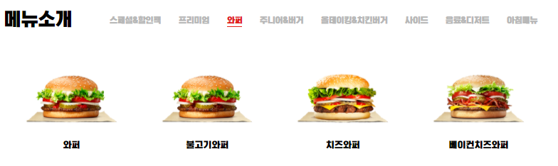
햄버거 먹고 싶다. 너므 너므 맛있는 햄버어그~
스페셜&할인팩 | 프리미엄 | 와퍼 표시는 ListBox를 사용한다. (Binding도 써볼까...? 했지만, 지금은 어려워할 거 같아)
(아래 내용은 ListView를 활용해서 조금 수정하면 동일한 UI를 만들어낼 수 있다.)
템플릿에 대해 정리해놓은 글이다. 아래 내용이 잘 이해 안 되는 경우 먼저 읽어보기 바란다.
chriskim10.tistory.com/4
- 기본적인 레이아웃에 대한 이해는 아래 블로그 내용을 살펴볼 것
- WPF에서 사용하는 기본 컨트롤의 스타일과 템플릿 참고
Step 1) 리스트 박스 추가
<Window x:Class="Kiosk.MainWindow"
        xmlns="http://schemas.microsoft.com/winfx/2006/xaml/presentation"
        xmlns:x="http://schemas.microsoft.com/winfx/2006/xaml"
        xmlns:d="http://schemas.microsoft.com/expression/blend/2008"
        xmlns:mc="http://schemas.openxmlformats.org/markup-compatibility/2006"
        xmlns:local="clr-namespace:Kiosk"
        mc:Ignorable="d"
        Title="샘플" Height="450" Width="800">
    <Grid>
        <ListBox x:Name="lbCategory"
                 Height="30"
                 VerticalAlignment="Top">
            <ListBox.ItemsPanel>
                <ItemsPanelTemplate>
                    <VirtualizingStackPanel IsItemsHost="True"
                                            Orientation="Horizontal" />
                </ItemsPanelTemplate>
            </ListBox.ItemsPanel>

            <ListBoxItem>스페셜</ListBoxItem>
            <ListBoxItem>프리미엄</ListBoxItem>
            <ListBoxItem>와퍼</ListBoxItem>
        </ListBox>
    </Grid>
</Window>
ListBox는 기본적으로 수직(Vertical)으로 데이터가 표시되나 우리는 아래쪽으로 쭉 표시되는 게 아니라 옆으로 쭈~욱 표시되게 보이고 싶으니 ListBox 내 ItemPanel을 위 코드처럼 변경해준다.
<VirtualizingStackPanel>은 StackPanel or WrapPanel로 변경해도 된다.
이 상태로 실행해보자 (CTRL+F5 or 디버그 메뉴 -> 디버그 하지 않고 시작)
디버그 말고 난 햄버그 먹고 싶단 말이다. 심한 내적 갈등이 파도처럼 밀려온다. 철썩~
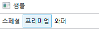
비슷하게는 나오지만 기본 컨트롤 형태이기 때문에 이제 스타일을 수정해 볼 차례
스타일은 ItemContainerStyle를 사용해서 수정할 수 있다.
<ListBox x:Name="lbCategory"
FontSize="16" FontWeight="SemiBold"
VerticalAlignment="Top"
BorderBrush="Transparent">
<ListBox.ItemsPanel>
<ItemsPanelTemplate>
<VirtualizingStackPanel IsItemsHost="True"
Orientation="Horizontal" />
</ItemsPanelTemplate>
</ListBox.ItemsPanel>
<ListBox.ItemContainerStyle>
<Style TargetType="{x:Type ListBoxItem}">
<Setter Property="Foreground"
Value="Gray" />
<Setter Property="Background"
Value="Transparent" />
<Setter Property="HorizontalContentAlignment"
Value="{Binding HorizontalContentAlignment, RelativeSource={RelativeSource AncestorType={x:Type ItemsControl}}}" />
<Setter Property="VerticalContentAlignment"
Value="{Binding VerticalContentAlignment, RelativeSource={RelativeSource AncestorType={x:Type ItemsControl}}}" />
<Setter Property="Padding"
Value="18,10,18,10" />
<Setter Property="Template">
<Setter.Value>
<ControlTemplate TargetType="{x:Type ListBoxItem}">
<Grid>
<Border x:Name="Bd"
BorderBrush="{TemplateBinding BorderBrush}"
BorderThickness="{TemplateBinding BorderThickness}"
Background="{TemplateBinding Background}"
Padding="{TemplateBinding Padding}"
SnapsToDevicePixels="true">
<ContentPresenter HorizontalAlignment="{TemplateBinding HorizontalContentAlignment}"
SnapsToDevicePixels="{TemplateBinding SnapsToDevicePixels}"
VerticalAlignment="{TemplateBinding VerticalContentAlignment}"></ContentPresenter>
</Border>
<Border x:Name="UnderBd"
Margin="18,0,18,0" VerticalAlignment="Bottom"
BorderBrush="Transparent" BorderThickness="2"></Border>
</Grid>
<ControlTemplate.Triggers>
<Trigger Property="IsSelected"
Value="true">
<Setter Property="Foreground"
Value="#E22219" />
<Setter TargetName="UnderBd" Property="BorderBrush"
Value="#E22219" />
</Trigger>
<Trigger Property="IsMouseOver"
Value="true">
<Setter Property="Foreground"
Value="Black" />
</Trigger>
</ControlTemplate.Triggers>
</ControlTemplate>
</Setter.Value>
</Setter>
</Style>
</ListBox.ItemContainerStyle>
<ListBoxItem>스페셜&할인팩</ListBoxItem>
<ListBoxItem>프리미엄</ListBoxItem>
<ListBoxItem>와퍼</ListBoxItem>
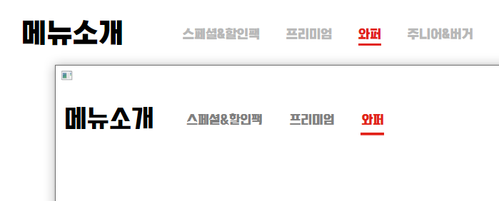
</ListBox>와~ 이게 뭐야라고 하겠지만 일단 복사해서 넣고, 모양이 어떻게 바뀌는지 살펴보자.
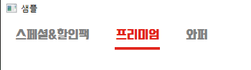
실행해보면 비슷하죠? (버거킹 폰트만 있으면 완전 똑같이 할 수 있지만 비슷한 배민 도현체를 사용)
일반 상태와 포커싱, 선택된 상태에 따라 색이 바뀌는 걸 볼 수 있다.
조금 더 마무리한 상단 카테고리 영역 결과
코드는 아래 Github 링크에서
github.com/ChrisKim10/DGSWSample
아래의 MSDN도 참고
https://docs.microsoft.com/ko-kr/windows/uwp/design/controls-and-patterns/item-containers-templates